THE IMAGE + ARTIST- Sunset by Gizem Vural
 |
| [a] |
We tend to think of time in units; a minute, an hour, a day etc. This can be easily visualised by putting images into boxes, as we already see that image as a separate unit. This has been clearly illustrated in Vural's depiction of a sunset, and instead of seeing as one whole image of the sun going down we instead see it step by step.
THE EXPERIMENTS


If we take 'Sunset' by Gizem Vural and remove the borders and squash the boxes together, already we have removed the segments and the sense of individual sections of time- creating a more 'whole' image of the sky

Rearrange the composition of these boxes, and now we can see a time line forming, although without the boxes we can still see a simple representation of time, and original time telling method, the colour changing sky.

Even removing the colour we can get a sense of time passes just by the use of light to dark, and this could be applied to a wordless narrative easily.

Having the colour move in a gif also creates a nice animation of time passing- and something to consider is creating an image that looks like it could be animated.
IMAGE + ARTIST- How to Decay Gracefully by SamSketchbook
 |
| [b] |
Sam's illustration of a decaying dog (or rat someone thought) looks almost instructional, helped by the numbers, boxes and title 'How to Decay gracefully'. Unlike Vural's use of changing colour, Sam uses action and almost 'movement' to depict the passing of time.
THE EXPERIMENTS

By removing the text and numbers we can still see progress throughout the image and the dog changing- and this is emphasised by the boxes themselves dissolving as the dog becomes a skeleton.
 |
| [c] |
(The use of the borders reflecting the illustration is an interesting technique and is also used by Tove Jansson in her Moomin comics.)

Like Vural's sunset I organised the decaying creature in a line, which I think is the most obvious way of displaying time- as we think of time in a linear sense. By arranging the dogs down the page, the audiences eyes build up to the end result.

Removing the boxes altogether and there is still an obvious progression of time, depicted by the changing of the dogs body bit by bit in order.
Below I rearranged the images so it created more of a pattern. As the audiences eye goes across the page, we can still see time passing even though they are not organised in lines or boxes.


Like with the sunset I wanted to see the combination of images moving, and again we can see this illustration translates into a gif well.
MY RESPONSE
Part 5. The Jump

Above is the illustrated section of story arranged in boxes. The first part of the story is more of a classic sequential narrative, showing a reaction/ action (Goram seeing that Avona has chosen Vincent, running and leaping off a cliff into the river) The second half I think reflects the experiments earlier, where the image stays mainly the same with just a little bit changing each time. Here Goram's body forms an island that becomes over grown as time passes.
Instead of using colour to denote the passing of time as Vural did with the Sunset images, I used a limited colour palette. I think makes the illustrations as a whole more cohesive and in the last few scenes the passing of time is shown by the changes to the island.

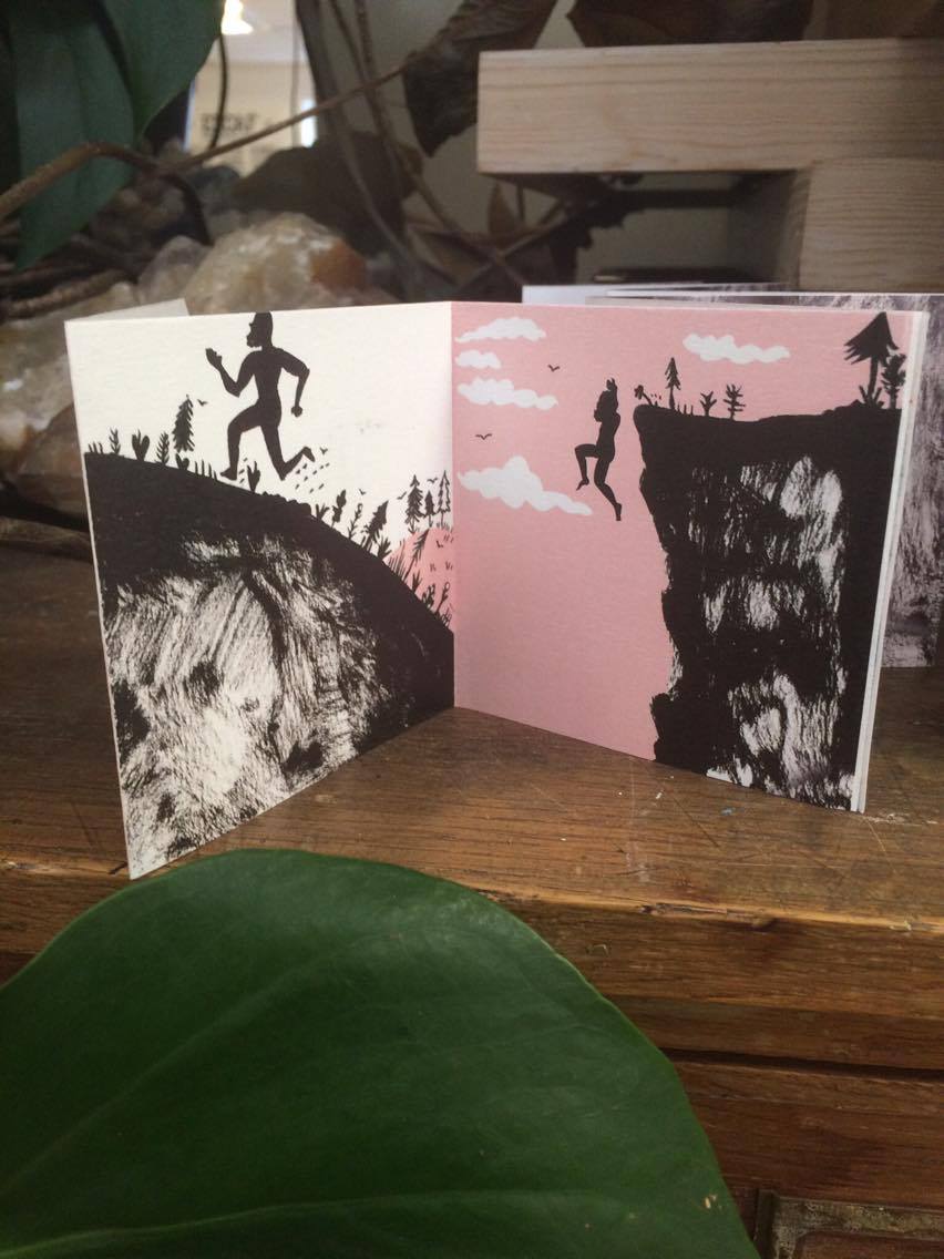


I first organised the images into a concertina book, as in the experiments putting the images into a linear formation made the effect of time passing more obvious, especially when it comes to the last few panels.

I also wanted to print the illustrations onto acetate so that the images could be layered. The images started out with a lot of white and get busier/ heavier in colour and black as time goes on. When layered this means that the image becomes murkier and heavier compared to the first illustration, which I think also emphasises time moving forward and also the sadness of this scene.

The gif is clearer when the digital images are used instead of the photos of the printed acetate, and so we can see that the end panels (as previously mentioned) are the most successful in portraying the passing of time- emphasised below when we use only those illustrations to form a gif:

IMAGE REFERENCES
[a] VURAL, GIZEM. 2017.
[b] SAMSKETCHBOOK. 2017.
[c] JANSSON, TOVE.
Bibliography
Vural, G. 2017. Sunset. [Online]. [Accessed 12 Jan 2017]. Available from:
http://www.gizemvural.net/comics#7
Samsketchbook.2017. How to Decay Gracefully. [Online]. [Accessed 17 Jan 2017] Available from:
http://samsketchbook.tumblr.com/post/154607813766/samsketchbook-the-text-reads-you-were
Jansson, T. 1958. Moomin and the Comet. [Online]. [Accessed 17 Jan 2017] Available from:
https://www.moomin.com/en/blog/the-boundaries-between-the-panels-in-moomin-comics/
No comments:
Post a Comment