For my first experiment I decided to storyboard
scenes from 'A Girl Walks Home Alone at Night'- I want to experiment with how altering the background of an image can change the atmosphere.
THE IMAGE + ARTIST A Girl Walks Home Alone at Night by Ana Lily Amirpour. Thumbnails/Storyboards by Me. [1]
THE EXPERIMENTS


The shots of the branches and the mining landscape are stark and create a eerie and moody atmosphere, and the silhouettes of the large machinery slowly moving against the grey sky are creepy and alien like. The landscape is also devoid of people, which projects this idea of stillness and isolation. Bad City comes across as mostly deserted, and this is emphasised by the location shots and stillness of the scenes.

The main character Arash and his heroin addicted father live in a dark,
small home. Whilst either high or going through vicious withdrawal, his father
lays on the floor all day watching TV whilst his son works constantly.

The 'Girl' lives alone in a basement, lonely yet
surrounded by posters and pictures. Again the black and white film and the
darkness of the film emphasises the loneliness and general miserableness.
Looking at these screenshots I wanted to try and alter
the atmosphere of the screenshots by adding colour and extra characters to see
if the tone and mood can be changed wordlessly. I picked a couple of the
screenshots that I think are the most visually interesting to change.
Mining Landscape

First I added colour to the mining landscape. By
switching the grey sky for a blue one this immediately lifts the image and we
think of the connotations of a blue sky, feeling happy and relaxed. Taking away
the black on grey image instantly releases the claustrophobic tone of the
screenshot.

I then decided to see if adding shadows and
highlights also broke down the solid silhouette which is quite harsh against
the pale sky. By adding these elements it brightens the image as the whole and
adds a softness to the structures.

I also wanted to add figures to the scene to
make it seem less money and isolated, but the figure themselves look a bit
creepy anyway. However just by altering the background/sky alone I think it
completely changes the atmosphere of the scene, from cold and lonely and
slightly eerie to a scene which is sunny, warm and slightly mundane, even.

The Girl's bedroom
The 'Girl's basement room where she lives alone is
dark and moody, reflecting one side of our main characters personality. However
her disco ball, posters and fairy lights also show that she does have human
side, and this is later shown in the film where she establishes a friendship
with Arash.

I added colour, again to try and add some warmth to
the image and to try and make it seem less isolated. I also tried to use muted
tones as to not make it too garish, and I think by adding colour it makes the
girl dancing alone in her room it makes it less sad and more 'normal looking'.
I also tried to emphasise the lights in her room to show depth and brightness,
using lighter colour on the fairy lights, disco ball and lamp. She in in more
solid colour to make her bolder and the main part of the image, when in black
and white I think she blends in with the background too much and becomes part
of the room herself.

As with the mining scene I added an extra figure to
alter the mood of the screenshot. Here instead of a girl dancing alone in her
room now there is a voyeur- and this immediately changes the tone. Now we know
that she could be dancing for someone, or that someone is about to dance with
her. It makes the image less lonely and adds some suspense.

From changing a sad atmosphere to a happier, or at
least neutral one, I wanted to attempt and take an image that is cheerful and
try and turn it the other way.
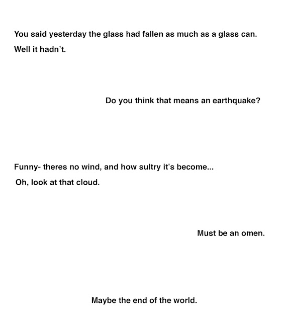
THE IMAGE AND ARTIST- Page from Moomin and the Comet by Tove and Lars Jansson
 |
| [a] |
I went for a coloured comic from Moomin and the
Comet, as it uses a minimal colour palette but with quite bright colours. From
glancing at the comic I think it seems fairly upbeat and happy, even though when
reading it we can see it is quite serious- and when I showed people this comic
strip they their immediate thoughts were that its cheerful and it wasn't until
I read the text that they realised what it was about.
THE EXPERIMENTS

THE EXPERIMENTS

First of all I tried to put it into greyscale to
see if removing colour changed the atmosphere of the comic. I don't think it
changes much as with the comic strip style and composition it just looks like a
standard comic strip you would find in a newspaper, and I don't think it alters
the mood.

To make it look less 'newspaper-y' I decided to
just make the image as black and white as possible. Again, a lot of the
original Moomin comic strips are black and white, so to me this sequence
doesn't look too bizarre or different. However I did remove background details
to try and make the scenes look more abstract, which maybe creates a more
unsettling theme.

I then decided to take away all the speech bubbles
and text to emphasis the abstract nature and to make the comic seem surreal and
lonely. The body language of the character and the interaction with each other
still carries the narrative.

To emphasise a sense of doom and to reflect the
original thumbnails I did for 'A Girl Walks..' I decided to use grey/black
washes to add depth and a painterly quality to the comic. I wanted to create a
dark and miserable atmosphere so added a grey washy sky and also emphasised
shadows on the Moomin, creating dark circles under their eyes to communicate
worry. In the last scene I made it darker around the edges to create a creeping
sense of doom, and creating a different mood to the set of drawings compared to
the colour version.
When I showed people the colour version and the
latest, painted version I asked if they could tell a difference in
mood/atmosphere. They all said that the painted one was gloomy and created a
sense of doom- whilst the colour one looked happy. However, once I read the
text to them they said that the painted one more reflected what was being said
even though it had no words. From this I know that by using techniques with
colour and lightening I can create a wordless image that can communicate
something- in the Moomin's case an impending sense of doom.
For something different, I also took the text and
wrote it out in the plainest way possible, removing any exclamation points-
which creates a serious and eerie conversation, which actually comes across as
matter of fact and cheery when put with the colour Moomin comic.

From these experiments I can see how mood and
atmosphere can change by altering the background content and colours- also
adding and taking away certain details can make a image seem more or less
surreal.
MY RESPONSE
Part 1: The Giants
Part 1: The Giants
For my response I wanted to make something where the background/
characters could be altered in order to change the
atmosphere or meaning of the illustration.


Using a rotating sky (on a split pin) and an extra illustrated flap, the
image goes from a peaceful to troubled. I used the same line work for both, so
body language and expression of the characters stay the same, but the mood is
altered by the different sky and the colour palette.
REFERENCES
[1] AMIRPOUR, ANA LILY. 2014
IMAGE REFERENCES
[a] JANSSON, TOVE + LARS
A Girl Walks Home Alone at Night. 2014. [Film]. Ana Lily Amirpour. dir. USA: SpectreVision/ Logan Pictures
Jansson, T (w), Jansson, L (i). Moon and the Comet. 2013. Montreal: Drawn & Quarterly
No comments:
Post a Comment